The What's for Lunch App - A UX Journey

I recently went throught the process of designing a mobile app for a certificate course I completed at SMU. Through this program, I learned a great deal about the user centered design process. It was an amazing course taught by industry experts J. Schuh, Brian Sullivan, Preston McCauley and Jamin Hageman. I worked as part of a team of three and here is what we developed.

What's for lunch app

The What’s for Lunch! App is for the busy person with barely enough time to eat during the day. It is a restaurant selection app that let’s you share the experience with your friends in real time. 


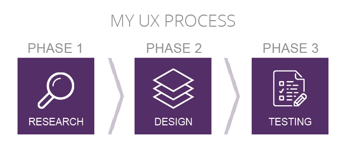
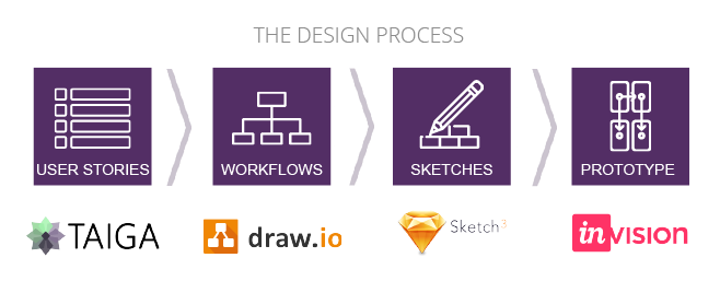
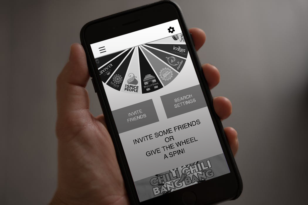
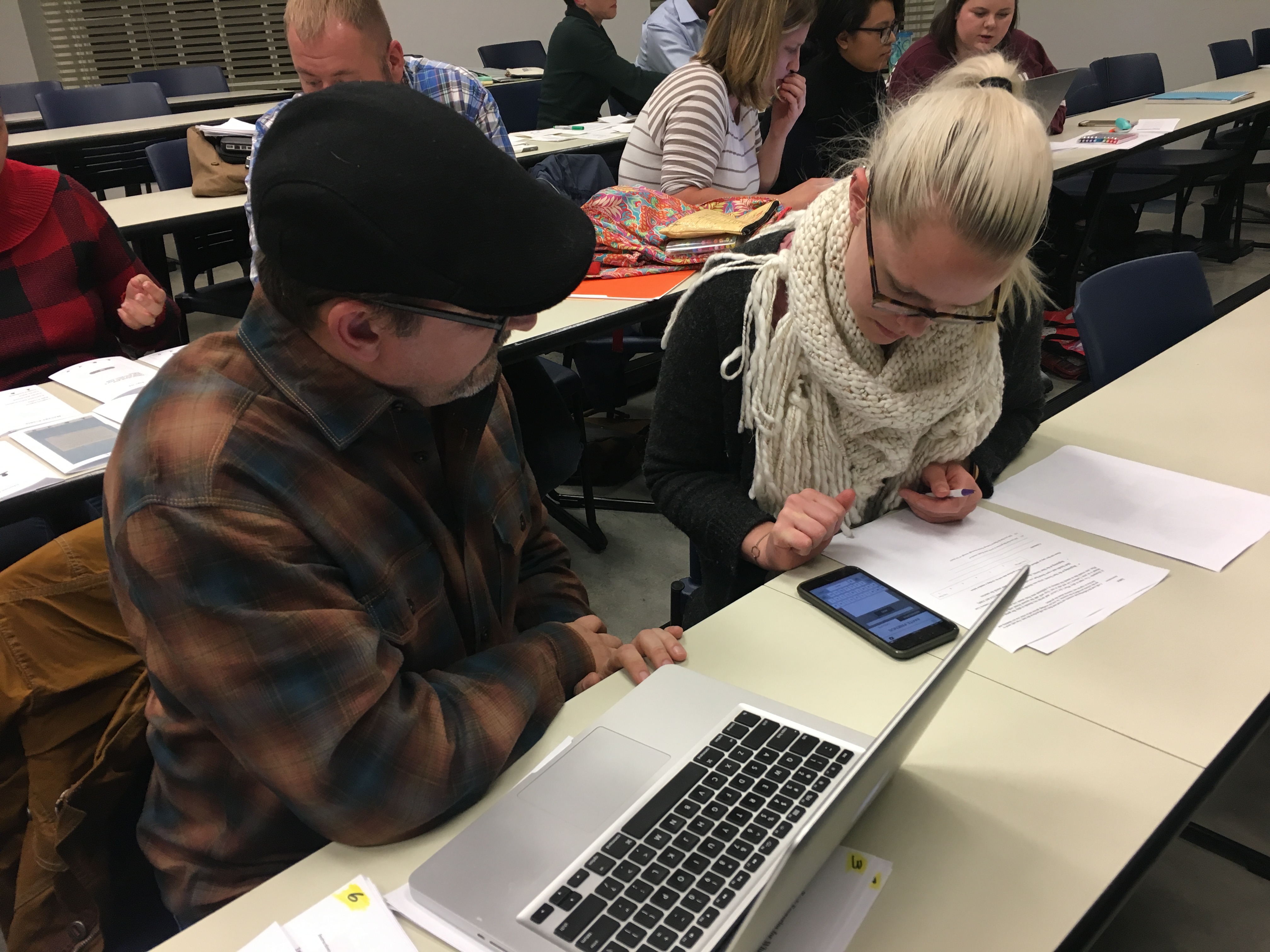
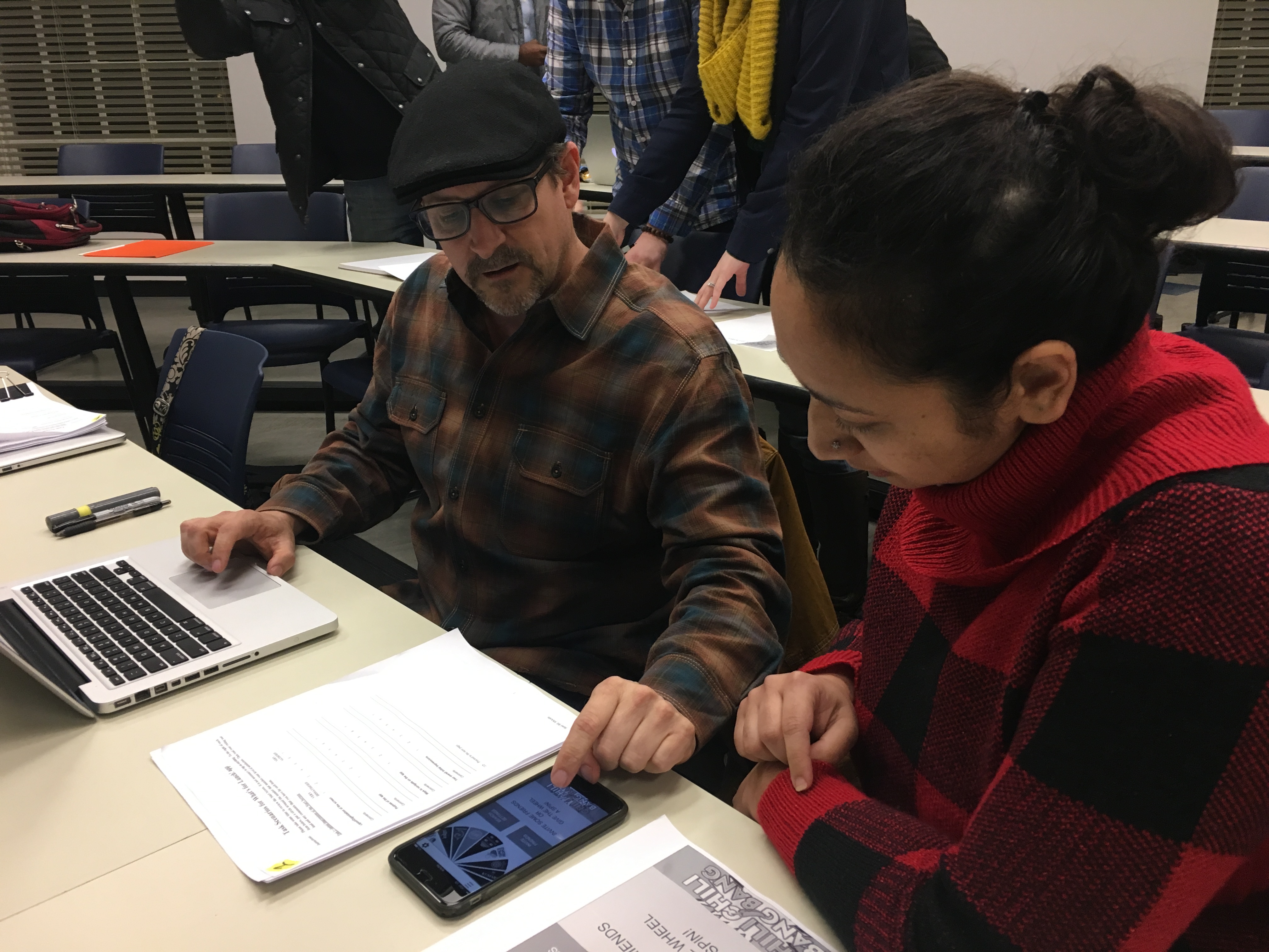
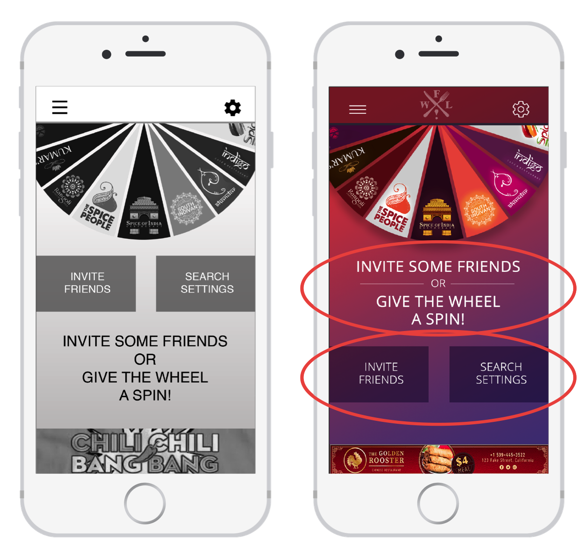
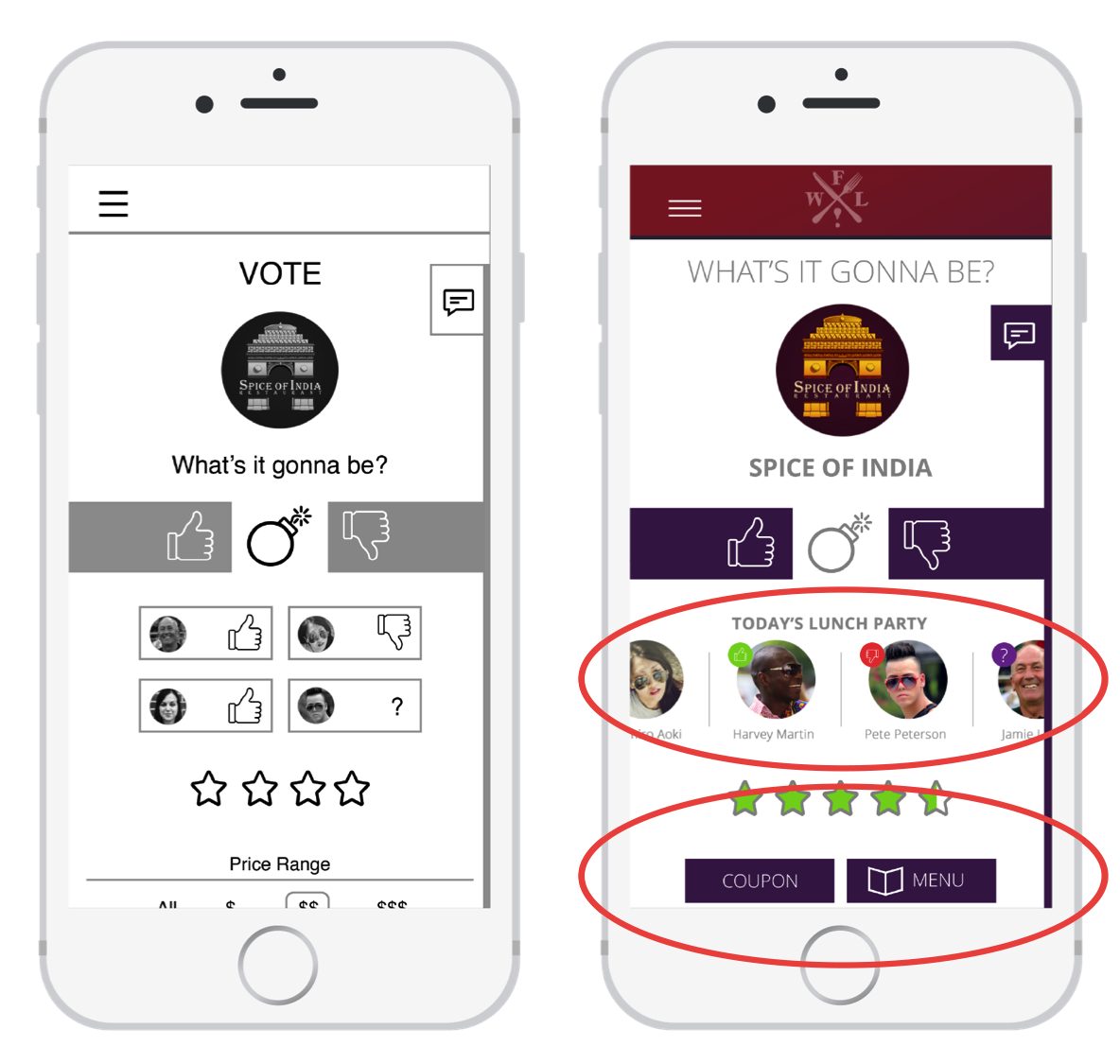
In order to design the app, our Design process included research, design and testing. During the research phase we gathered facts and opinions. Next came the design phase, during which where we took those facts and began to sketch screens, ideate and then prototype. Finally we took those screen designs and the prototype and put them to the test with typical users.

My UX Design Process

User Research
During the research phase we analyzed competitors, conducted user interviews and deveolped user personas to understand our target audience. These artifacts provided a foundation for the app as we moved forward.

Competitor Logos


Design
As we began to design the app the first step was to create Epics and User Stories, exploring the needs of our users. We then moved into workflows so that we could understand the app processes. Several rounds of sketches allowed the screens of the app to take shape and finally a click through prototype helped us to further understand and refine the workflows.


The Design Process

One of our Epics was “I want to be able to share the game experience with my friends”. The user stories we developed here helped us to work through and understand the viral aspect of the What’s for Lunch! app.

Epics and User Stories

The workflow served as a high level overview allowing us to see the functions of the app at a glance, helped us identify gaps in functionality, and explore the experience for different users.


At this point we began sketching the interface. We explored 3 design options for each screen and then went on to further refine the design chosen. Once the sketches were refined, we moved into black and white digital artwork, continuing to make improvements as we went along.

Our final step was to develop a click-through prototype in Invision. Click on the image below to launch the prototype.


In developing the prototype we explored scenarios such as inviting a friend, changing the location of the search, voting, and viewing a coupon. As we developed the prototype, we continued to refine our workflows and better understand the user experience. We were now ready to test the app.


Usability Testing
We took our designs and prototype and conducted a usability test with 6 subjects, testing their initial impressions as well as affordances and expectations. We also asked them to perform a few tasks, then had them rank us for usability. Each test was administered by a moderator who walked them through the test and recorded the results. An observer recorded non-answer data such as hesitations, facial expressions, and ease or difficulty in performing the task.


Testing image 1
testing image 2

Changes to the Prototype
After testing was complete, we analyzed the data we obtained to see where improvements might be made to the What’s for Lunch! app. The overall feedback was positive, but there were several areas that we wanted to improve based on what the users had to say.


On the game screen users were a bit confused on what to do first and had difficulty interpreting the meaning of the call to action. To improve this we moved the buttons below the call to action and closer to the user’s thumb when opperating their phone with one hand. We also used a rule line and adjusted font sizes to make the call to action more readable.


When voting, users were unsure what the lunch party section was and what it communicated. They also expressed frustration with having to scroll to find the coupon and menu buttons. We improved this by making the lunch group items larger while having them scroll horizontally to avoid taking up more vertical space. We also moved the coupon and menu buttons above items of lesser importance to the users.


Power Point Presentation and Full Color Prototype
At the end of the course we presented our app design to the instructors, our fellow students, and some industry professionals. The feedback was very positive. Click here to view the presentation and click through the prototype below to see how it all came together.

WFL ppt presentation